The Snapshot October 2020
This edition of the Snapshot newsletter is focused on a new Snapshot Wisconsin product, the Data Dashboard. The Data Dashboard is an interactive tool that let’s the public explore the data that Snapshot has collected in a new and exciting way. This dashboard marks an important step towards Snapshot’s goal of making its data more accessible to the volunteers who helped collect it, as well as the public more broadly.
You can learn more about the development of the dashboard, as well as what features are currently available on it, in this edition of the Snapshot newsletter, or you can check out the dashboard for yourself at https://widnr-snapshotwisconsin.shinyapps.io/DataDashboard/
A Volunteer Explores The Data Dashboard
The Snapshot team virtually sat down with a long-term Snapshot volunteer on Skype and let them explore the Data Dashboard. Follow along with their discussion for an informal walk-through of the dashboard.
Building the Data Dashboard - From Inception to Release
The developer of the Data Dashboard shares how he and the Snapshot team went about building the tool and determining which species would be included. The developer also discusses how initial volunteer feedback was incorporated into the tool.
A Volunteer Explores The Data Dashboard
Snapshot Wisconsin released its new data visualization tool to the public today. The tool is called the Data Dashboard and is a major step towards bringing the project full circle. The Data Dashboard offers volunteers and the public a new way to engage directly with this data, letting people choose which data they want to visualize.
At launch, the data for 18 animal species is available to explore, including how active species are during different times of the day and year and how the species are spatially distributed across the state. Data can be viewed for specific counties or statewide, and the data from maps and graphs can even be downloaded to share with others.
Christine Anhalt-Depies, project coordinator for Snapshot Wisconsin, described the intention and purpose of the dashboard. “The purpose of the dashboard is to close the loop - to make sure that people who are involved in collecting data have an opportunity to see the outputs of their work,” said Anhalt-Depies. “This first iteration of the dashboard is focused on giving the public a chance to explore data they’ve helped to generate.”
Exploring the Data Dashboard with a Volunteer
One of the best features of the Data Dashboard is that it lets people explore the wildlife in our state at their pace. The dashboard is open ended and can be explored in whatever order you want, but sometimes a guide is nice to follow along with. A member of the Snapshot team virtually sat down with a long-term Snapshot volunteer on Skype and let them explore the Data Dashboard.
Tim Sprain has been a volunteer with Snapshot Wisconsin for nearly 3 years. He hosts three Snapshot cameras in three separate counties. Sprain is a middle school teacher and uses Snapshot in his classroom to describe biology concepts in an interactive way. Sprain shared his screen with Sarah Cameron, a member of the Snapshot team and head of the educator engagement side of Snapshot. Here are some of the highlights from the discussion between Sprain and Cameron.
The Map of Wisconsin – Counties and Ecological Landscapes
While Sprain was getting set up to share his screen, Cameron said, “One thing I like to remember when talking about the dashboard is the fact that we were literally sitting in a room at the DNR office about two years back, brainstorming how we can share the data that the volunteers were collecting back with them. We had this grand idea of a dashboard but had no idea how we were going to accomplish it. It’s been really exciting to see the progress over the years and have a product now that we can give back to our volunteers - something they can connect to.”
Sprain agreed and added, “A lot of times, people don’t have the knowledge or resources to understand what animals are in their backyard. I see this dashboard as a huge resource to educate them. My goal [as an educator] is to be a catalyst for experiential learning, and Snapshot Wisconsin is all about making sure people get a chance to be involved.”
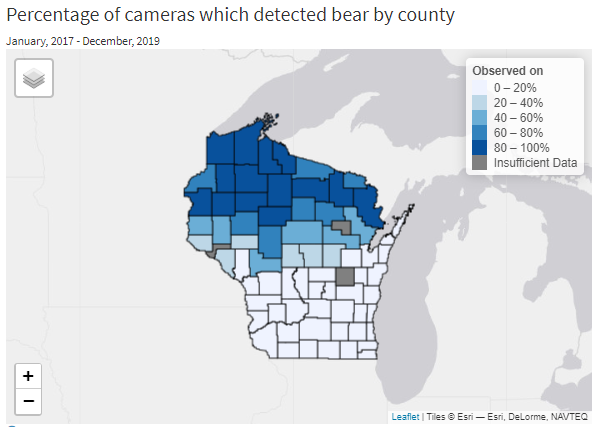
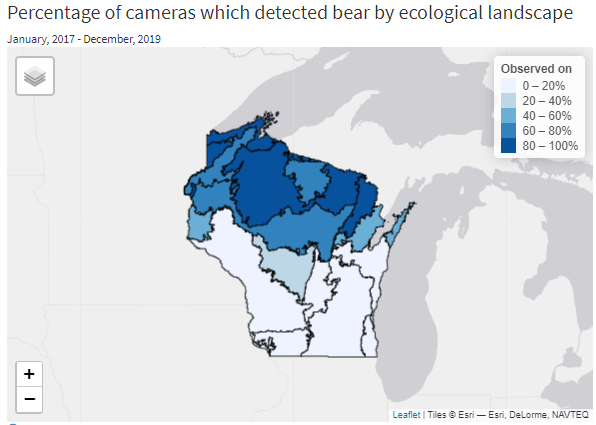
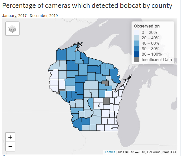
“Years ago,” continued Sprain, “[DNR staff] pointed me towards what the DNR offers to families and students other than hunting, fishing and trapping, and I’ve kept up on the email updates that the DNR sends out. When Snapshot Wisconsin came onboard, it was a natural fit.” Sprain finished loading the Data Dashboard on his computer and was ready to explore the dashboard. Sprain started with the map of Wisconsin (on the left side of the dashboard). The map shows how many of the trail cameras in a given area have captured the selected species. The map can be broken into counties or ecological landscapes, such as the Northern highlands or Southwest savanna.
Sprain said, “I’m excited to share the map of Wisconsin with my students, because it has ecological landscapes. It will help them understand how humans and animals use different landscapes and that animals have adaptations to suit the habitat in their landscape. Habitats are the most important piece towards maintaining our rich diversity of animals and flora in the state, which is an indication of our health as humans. This awareness can help build the understanding that we are all in this together. It’s also cool that you have the ecological zones because ecological borders are more real [to wildlife] than county lines.”
Sprain hovered over the three counties he has cameras in and started clicking on different species. Sprain mentioned how he has had to use a different approach this year to incorporating Snapshot into his teaching, since Sprain’s school district is starting virtually. Sprain explained, “In a normal year, [my class and I] would take a trip in the first week of school. I take them to a forested park and ask them what they notice. The kids ask me questions [about the plant and animals they see], and I introduce Snapshot Wisconsin by showing the trail camera pictures. I ask again, ‘What is this,’ or ‘What do you see now?’”
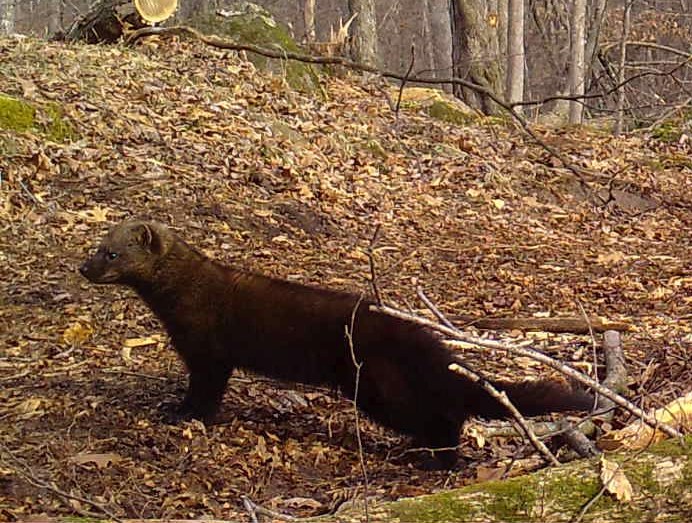
“Often times students will recognize a deer, but they get confused when they see a coyote, fox or wolf,” said Sprain. Sprain recalled a special moment of discovery he had with his students. “When they saw a fisher, it was just the most wonderful moment of learning. They didn’t know what a fisher is, but [to them] it looked sort of like a wolverine. They couldn’t quite figure it out.” Sprain used this moment to teach his students something new about fishers. “Now, they feel this connection to knowing something that they didn’t know before about this mysterious creature living in their bluffs.”
Sprain hovered over La Crosse county specifically, since that is where the camera that saw the fisher was located. Sprain was excited to discover that there was only one camera out of 13 in the county that had seen a fisher. It was his camera.
Cameron added, “It will be really cool to share with your students that the data they helped collect got that one point out of 13 in La Crosse county. I’m also glad you mentioned fisher, because that wasn’t there [until recently.]” Fisher, as well as four other species, was added to the dashboard in response to the feedback volunteers gave during a soft launch to trail camera hosts.
Sprain joked, “You should have seen the look on the landowner when I shared the [fisher discovery] with the family. They were dumbfounded. They didn’t even know what a fisher was!”
“Oh, that’s so funny,” said Cameron. “That was one of our early and exciting findings of the project, realizing that fishers were a lot farther south in the state than we expected. We’ve had a lot of people come to us and say, ‘Wow I caught a fisher on my property! I didn’t know they were down here.’”
Why species were included or excluded
Sprain moved on from the map and started looking more closely at the Species list next to the map. There are 18 species currently available on the dashboard – some common species and some rare like wolf and elk.
“Students always ask after all the carnivores, as well as ones that are unique like porcupine,” said Sprain. “I love that porcupine is on the list! The kids love porcupine.” Between his three cameras and a few annual field trips, Sprain’s class gets to see quite a few of our Wisconsin species. “We don’t have any wolves on our cameras yet, but I see [on the dashboard] that other cameras have picked them up in my counties… so they are there.”
Sprain and Cameron continued to discuss different animals that his students like seeing, and the conversation turned towards species that weren’t included on the species list, namely beaver.
Cameron directed Sprain to look under the species list at the blue text about missing species. Cameron said, “We thought that would be a question that would come up quite a bit, so this popup provides some extra information [on why some species were included and other excluded.]"
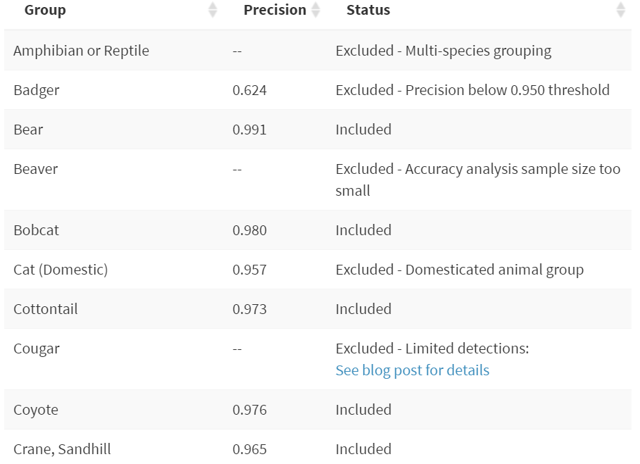
This popup explains the main criteria to be included on the dashboard, having a 95% accuracy rate. An accuracy rate is a measure of how often volunteers correctly classify a given species. If photos of a species are classified correctly at least 95% of the time, then that species was added to the dashboard. There is also a table with every species that Snapshot volunteers can classify, such as the partial table below. Each species on the list has an accuracy rate and explanation if it wasn’t included.
Anhalt-Depies jumped back into the conversation and said, “For species with low accuracy, we will eventually be able to provide an expert review of that species’ photos, such as badger with an accuracy of .624 [which is below the .95 or 95% cutoff]. We will be reviewing those photos and including them in a later version of the dashboard.”
The Snapshot team knows there are some classification errors in the data, but anything with an accuracy above .95 is acceptable for this purpose. Sprain ask Anhalt-Depies about the two cameras in Milwaukee county with snowshoe hair detections, and Anhalt-Depies explained that those are likely misclassified and within the 5% of the time the data was incorrect.
Sprain replied, “I like that there is a discussion of accuracy and human error. Science is not perfection, but to see these [accuracy rate] numbers… now I understand why a species wasn’t included.”
Sprain and Cameron each commented on how impressed they were overall with the accuracy of Snapshot volunteers. Cameron said, “One thing I encourage for volunteers who want to help increase their accuracy is to involve others. You [Sprain] mentioned that your students work together to classify photos. My dad calls me basically every time he checks his camera to verify that a photo is an opossum… or a racoon. Just having a couple eyes on the photos increases accuracy but also makes it a more enjoyable experience working with others.”
Sprain jumped in and added, “That is what it is all about, a social network of citizens contributing to science! Working together for a much bigger purpose but also feeling great about seeing the wilderness and ecology in the state of Wisconsin - that is the goal.”
Visualizing Animal Activity and Detection Rates
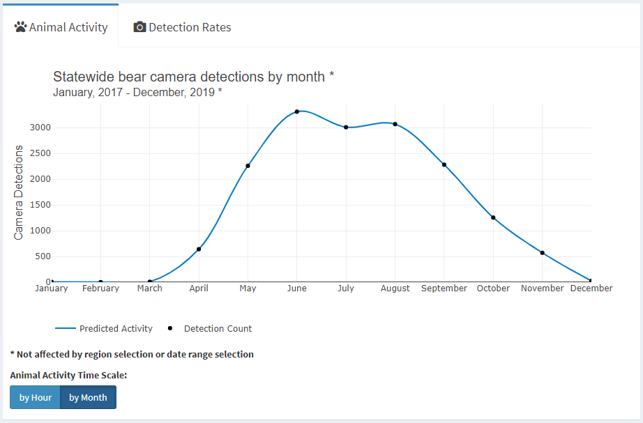
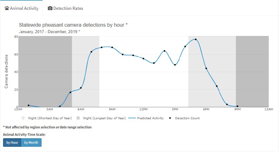
Soon, Sprain had moved on to the next section of the dashboard, the graph of animal activity. The graph, located on the right side of the dashboard, plots how many times a species has been seen at each hour of the day or each month of the year, depending on which option you choose.
“I like that you can see activity by hour or month,” said Sprain. Sprain started making connections between activity patterns he observed and known behavior of those species. Bears, for example, become more active during the spring and summer months yet are rarely seen during the winter. “I’ll ask my students the question, why are they so active during certain months? Some students think it is a difference in population size, instead of a behavioral difference like preparing for hibernation or reproduction. I get a lot of giggles in the seventh-grade classroom, but the question is very relevant to teaching animal ecology and biology.”
The graph can also be adjusted to show which hours of the day a species is more active. The dashboard shows that sandhill crane, for example, are mainly active during the day but are most active between 10:00am-1:00pm. Bird watchers could increase their chance of spotting one by using the dashboard to find its peak activity times. The same could apply to any of the 18 species shown on the dashboard.
The second tab of the activity chart shows detection rates. Initially set to show the top five species detected state-wide, the detection rate chart can show much more than you may expect. If the selected species isn’t among the top five species, it will appear as a sixth bar on the chart. Additionally, individual counties can be selected to show the data for both the state and selected county. Using these features together, Sprain was able to discover that bobcat, elk, porcupine, and wolf were detected slightly more often in Jackson county, where one of his cameras is located.
Overcoming Insufficient Data
Three counties don’t show species data and are labelled as insufficient data. These counties have less than five cameras. If enough data isn’t being pulled from cameras in a county, then the dashboard doesn’t make a lot of sense. For example, let’s say you live in a county with only one camera. If a rare species like the whooping crane walks across that camera, then that species now has a 100% detection rate (one camera out of one camera) in that county. The dashboard would give off the impression that whooping cranes were extremely common in that county, when the species is actually quite rare. This is why Snapshot requires a minimum of five cameras per county before the dashboard will show data for it. If you live in a county that is labeled as Insufficient Data, then consider hosting a camera or encouraging others to host one. There are a lot of opportunities, not only on private lands, but also on public lands to host Snapshot cameras.
Cameron said, “There are a lot of ways to get involved, no matter where you are or whether you have access to land. Snapshot is a really unique project in that there are so many ways to get involved. You could host a trail camera, classify photos online or just participate in some of the educator resources. There is a lot to explore and to offer!”
Even if you are just interested in learning about wildlife in the state, you can help out Snapshot by giving them feedback on the dashboard. There is a survey at the bottom of the dashboard for anyone, not just volunteers, to offer ideas for future versions of the dashboard. After all, the Data Dashboard is designed to help Snapshot come full circle, so they want to hear from you. While not every idea can be implemented, the major themes in the survey responses impact what the team focuses on moving forward.
Cameron reiterated, “The data dashboard isn’t just for Snapshot volunteers. It is for anyone interested in Wisconsin wildlife. Snapshot and the Data Dashboard are special because they wouldn’t be possible without our trail camera hosts and folks classifying online.”
Let’s Discover Our Wildlife Together
Snapshot’s slogan, “Let’s Discover Our Wildlife Together,” isn’t a mistake. Snapshot is a project about people (from Wisconsin and across the globe) working together to monitor our wildlife. “While we know so much about Wisconsin wildlife, there is still so much we don’t know,” said Cameron. “Having tools like this dashboard help us fill in those gaps and get a more complete picture of what is really happening in Wisconsin.”
Sprain added, “[The dashboard lets] each citizen take away a piece of Wisconsin culture and have it become a part of their life. There is no denying the presence of these animals on the cameras. That is the power of this data.”
Whatever your motivation for wanting to see Wisconsin wildlife, check out Snapshot Wisconsin’s Data Dashboard. Version 1.0 is now available to the public.
Lastly, Anhalt-Depies offered Snapshot’s hope for the future of the dashboard. “We are now at a point where the project has really good coverage across the state. Our hope is that, as the dashboard evolves, it becomes a powerful tool for decision makers,” so keep an eye out for what is available in future versions of the dashboard!
You can visit the Data Dashboard at https://widnr-snapshotwisconsin.shinyapps.io/DataDashboard/
Building the Data Dashboard – From Inception to Release
The idea of the Data Dashboard originated about two years ago, stemming from a desire to bring what Snapshot has learned full circle back to the volunteers and public. However, no one knew at the time what would eventually manifest from that desire. No one knew that the Data Dashboard was on the horizon.
The core purpose of Snapshot Wisconsin is to provide data for wildlife decision support and bringing citizens into that process. Citizen science projects like Snapshot Wisconsin rely upon the public’s aid to accomplish tasks that would be unfeasible or impossible otherwise, and making sure volunteers feel fulfilled and satisfied with their time investment is important to the Snapshot team.
As part of her dissertation research, Christine Anhalt-Depies, the project coordinator of Snapshot Wisconsin, investigated why volunteers joined the program, hoping to learn their motivations and reasons for staying. Her surveys taught the team much about what they needed to focus on to keep volunteers feeling fulfilled.
Two of the survey’s findings stood out to the team. First, many volunteers cared deeply about contributing to wildlife monitoring and wanted to see what wildlife was in their area and the state. Volunteers also wanted to see the fruit of their work, how the project was contributing to wildlife management decisions across Wisconsin. The Snapshot team knew from these findings that they needed something that would close the loop, bringing the data full circle.
To help close the loop, the Snapshot team decided to focus on making Snapshot findings more available and accessible to the public. They needed a tool that everyone could use and learn from. With that daunting task in front of them, the team started by investigating what kinds of platforms were even available for this type of visualization tool.
The Snapshot team explored many options but ultimately settled on R Shiny, an extension of the statistical software R, and soon a prototype was being built. The initial prototype of the dashboard started as a map of Wisconsin, but the team wanted to show more. The team needed a specialist with a vision of what the tool could become.
A Fresh Face Joins the Team
In November of this last year (2019), a new member joined the Snapshot Wisconsin team, and he would play a leading role in developing the Data Dashboard.
Ryan Bemowski, Data Scientist and Engineer at the Wisconsin DNR and developer of the Data Dashboard, recalled what it was like joining the project at this time. “There were many discussions still going on about what the tool was going to look like. The team was trying to figure out how they could best display the data in a way that was meaningful to volunteers and the public,” said Bemowski. “My primary task was to get the visualizations made by deciding what data to display and come up with ideas for the visualizations.”
Bemowski spent the next eight months reimagining the look and feel of the Data Dashboard. Bemowski kept one central piece of the prototype, the map of Wisconsin, but simplified it to show the percentage of cameras in each county or management unit that have detected the selected species at least once.
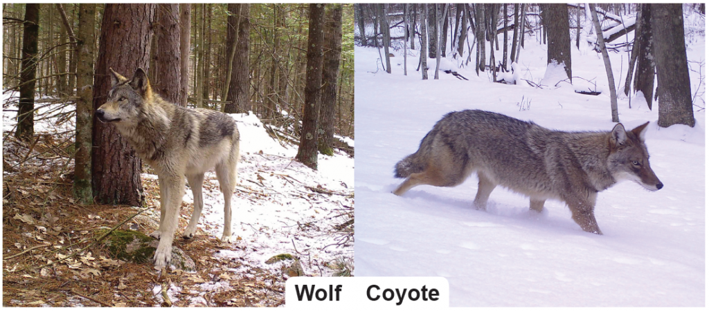
During these months, he also dived into what other data would be shown on the dashboard. Snapshot Wisconsin cameras have taken over 47 million photos to date, but many of these photos don’t contain animals. The majority of the photos that do contain animals will be classified correctly. However, the team knows that not all the photo classifications are accurate, complicating their use. Some species are particularly difficult to classify, often being mistaken for similar species, such as wolves (below left) and coyotes (below right).
Bemowski and the team wanted to show as much data as possible. However, they didn’t want to add data to the dashboard that was inaccurate, so they needed a way to determine how accurate the community was at classifying each species.
Bemowski explained the team’s approach to solving the inaccuracy issue. “We ran a round of accuracy analyses to see how accurate [classifications] are for each species, but we ended up only able to do the analysis for certain subsets of species,” said Bemowski. An accuracy analysis is a test to determine how many of the photos of a species are correctly classified using a sample of photos. The team’s accuracy analysis yielded an accuracy rate for most species. However, it didn’t work for certain species. “When you run an accuracy analysis, you must have a big enough sample for each species. In our case, some species like beaver just didn’t have enough photos to be analyzed properly.”
Additionally, a few species were analyzed but still excluded because of their low accuracy rate. Volunteers are overall very good at identifying most Wisconsin species, but some species are difficult and had a low accuracy. Bemowski mentioned that the team will continue to run more accuracy analyses and work towards getting all species on the dashboard eventually.
The Soft Launch, Feedback and Improvements
After much work, Bemowski and the team were ready mid-July to test out their tool with a soft launch to a handful of volunteers. They chose the 1,700 volunteers who host Snapshot trail cameras and asked for feedback on the dashboard. Around 90 responses came back, and three main themes emerged that the team began to think about.
First, the volunteers wanted clearer explanations about why species were included or excluded. Second, there was a desire that certain species be added to the dashboard, namely wolf and elk. Lastly, volunteers wanted to see data at a more granular scale, such as being able to see the data for specific cameras instead of countywide.
After reading the survey responses, Bemowski and the team set about incorporating this feedback and getting the dashboard ready for the full launch to the public. The first theme was easy to address. Bemowski added a clickable pop-up (below the species list) to the dashboard that shows the accuracy rate for each species. Simultaneously, Bemowski and the team were able to finish the accuracy analyses of three more species and added them to the dashboard: Snowshoe hair, pheasant and fisher.
The second theme that emerged was a desire to see certain, high-interest species on the dashboard. Bemowski explained, “The reason we excluded some species [for the soft launch] is because, below a certain accuracy, we know some of the data is incorrect. If a species has a 50% accuracy rate, for example, we know that 50% of the data being shown is correct and 50% is incorrect.” The data for species with an accuracy rate below 95% is still stored and used in other ways, but the team wanted all the data on the dashboard to meet a minimum quality standard.
The team thought of a clever way to balance the public’s desire to see high-interest species like wolf and elk with their data accuracy standards. The photos of species with low accuracy and species of special interest go through an extra round of classification by species experts to confirm which photos are correct, so the accuracy of the expert-classified subset of photos is 100% and meets the data quality standards. The Snapshot team collectively decided that the best way to include the data for elk and wolves was to only use the expert-confirmed photos on the dashboard. Bemowski said, “We want to show correct data, as accurate as possible, without holding anything back.” This decision was the best compromise the team came up with.
The last theme focuses on granularity, or the scale to which you can “zoom in.” Some volunteers wanted to see beyond the county scale and look at data from individual cameras. Bemowski was conflicted about the topic of granularity though. “We don’t want to give the exact latitude and longitude of the cameras because of privacy concerns, but we still wanted to give as much granularity as possible.” Showing data at the county level is as granular (or “zoomed in”) as Snapshot can currently go, but the team hopes to eventually have individual dashboards for each camera’s host so that they can see the data for their cameras. However, that is still in the planning stage.
What’s Next for the Dashboard?
Now that the dashboard is released, Bemowski reflected upon what the dashboard means to the project. “I’ve realized recently how big of a step this dashboard is for Snapshot Wisconsin: To go from collecting millions of photos to showing people what the data is saying and really analyzing that in depth. That’s a big step. Looking back, the intention has always been to transform Snapshot data into actionable outcomes,” but the Data Dashboard marks a major step towards Snapshot sharing its findings with the public.
The Data Dashboard’s current version is focused on making Snapshot’s findings available to the public, but more updates and additions to the dashboard are already on the planning board. “The Data Dashboard is an evolving product,” said Bemowski. “We are going to go through many iterations of it to improve the quality and abundance of data and species available. The next step is to build upon the dashboard so it can be more meaningful for decision makers, such as the county deer adivory councils (CDACs) and other wildlife management organizations around Wisconsin.”
Bemowski offered some advice for anyone going outside to interact with nature. “Improve your chances of seeing your favorite species by using the Dashboard to observe wildlife during their times of peak activity or use the dashboard to see if your favorite species have been detected in your county. Even if you don’t see your favorite species, you may be surprised at other wildlife you do see.”
Bemowski and the Snapshot team are momentarily celebrating reaching this important milestone before they continue to improve the dashboard. Bemowski said, “I wish I had something like this as a kid. I grew up in Wisconsin. I grew up a hunter and fisher; someone who enjoys the outdoors. I always heard that there isn’t enough information about wildlife, that people just don’t know what is there, and that all the ‘guesses’ from wildlife organizations [about what is around] aren’t true.”
“But the Data Dashboard is as close as you can get to really knowing what is out there,” continued Bemowski. “Drawing from a growing collection of over 2.3 million animal sightings from over 2,200 cameras locations across Wisconsin, the dashboard is a really awesome way to discover and experience these animal sightings.”
If you want to explore the Data Dashboard yourself, you can access it at https://widnr-snapshotwisconsin.shinyapps.io/DataDashboard/


